CASE STUDY
Rebuilding checkout for speed
A 40% faster flow, shipped in six weeks. Card rests at elevation 1; hover lifts it to 2 with the standard easing.
Read the study →

Google-font native. Apple-leaning, Material-informed.
The identity you know — rebuilt for the web we design.
02 · The Mark
The alpha inside the triangle stays exactly as drawn — first letter of the Greek alphabet, value of one. Nothing here changes it; this page only restates its rules in the new layout.

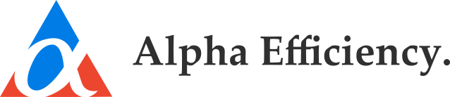

Clear space. The height of the logotype’s capital A, on all sides. Nothing enters it.
Minimum size. 25 px on screen, 9 mm in print. No maximum.
Never. Stretch, recolour, resize parts, reposition, reverse colours, or rotate.
03 · Color
The full palette carries over. Blue and red lead; yellow, orange, black and grey stay accents. Interactive surfaces borrow Material’s state layers — the color never changes, a black overlay does.
Neutrals — canvas #FDFDFD to ink #303030, verbatim from the identity
04 · Typography
Two families, as the guidelines always intended. One Google-hosted sans does the work; Lora keeps the logotype and earns editorial display moments. Current sans: Inter.
Efficiency
AaBbCcDdEeFfGg 0123456789 — 08:15:42
“People seeking what we provide need look no further.”
05 · Interface
Material’s button hierarchy, Apple’s restraint: filled for the one primary action, tonal for secondary, outlined and plain after that. Surfaces float on soft elevation; the bar blurs like glass.
44 px minimum hit target · radius 12 · hover +8% · press +12%
CASE STUDY
A 40% faster flow, shipped in six weeks. Card rests at elevation 1; hover lifts it to 2 with the standard easing.
Read the study →
FORM FIELD
Rest is filled and quiet; focus draws the 2 px blue ring.
List rows, Apple-style; the hovered row shows its 4% layer.
06 · Motion
Calm by default. Fades and small translates on the standard curve; the emphasized curve is reserved for hero moments. Nothing bounces. Honour reduced-motion.

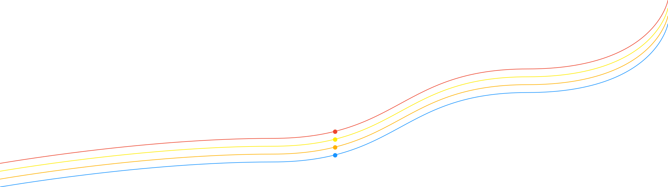
Four colors are flowing through the Alpha Efficiency Logo mark: red, yellow, orange, and blue. Each color represents one service department that Alpha Efficiency provides. By combining these colors, we get wave lines permeated with those departments — resulting in harmony between services which characterizes Alpha Efficiency’s identity.
The lines can be deformed, and it is possible to change their direction and curvature depending on the application. There must be no sharp curvature in their application.
07 · Spacing & Grid
Material’s 8-px grid, applied with Apple’s generosity: everything sits on multiples of 8, page margins are 64, and no touch target drops below 44 px.
SPACING SCALE
Inside components: 8–24.
Between components: 24–48.
Between sections: 64–96.
CORNER RADII
Radii step with size — small elements stay crisp, large surfaces get the soft Apple sweep.
PAGE ANATOMY — 1920 DESKTOP
08 · Iconography
The bespoke two-tone set — AE Blue + AE Orange spot illustrations — is retained exactly as drawn.
RULES
Two tones only. AE Blue #1994FF linework, AE Orange #FFB000 accents, on light surfaces.
Spot scale. These are illustrations, not UI glyphs — use at 64 px and up.
For UI glyphs (chevrons, close, menu) use simple 1.5 px strokes in the text colour; never restyle the spot set.
09 · Iconography II
Service and product marks (Alpha Academy, Alpha Idea, Alpha Security, Alpha Essence) plus task states and the See More / See Less pair. Also retained exactly as drawn.
10 · Application
The signature application: the four service lines flow across the surface, each anchored by its dot, and the Lora logotype voice signs off. Use it on banners, covers and ad ends.